Pages

Sunday, July 1, 2012

Color Theory Fun 2

My last "three colors and white" experiment turned out so well I decided to try it again (coulda' been a fluke, right?). But, this time I decided to try a different blue, one that I used a few times long ago and then abandoned because the results were so horrific. Prussian Blue.

So I dug around in my old supplies and came up with the crumpled metal tube that was my Prussian Blue from so long ago. When I do experiments like this, it is one of the few times I am glad I am a pack rat.

Cad. Yellow.........Cad. Red.........Prussian Blue........White

Clouds in Prussian Blue    8"x8"

Prussian Blue has won me over! Why did I hate it before? It's strong and can get out of hand if you are not careful, but what dynamite skies and green fields it makes. By using only three primary colors and white it becomes a much easier to achieve color harmony. 
Sometimes less is more!

Wednesday, June 20, 2012

Color Theory Fun

I love color theory, and though most of what I have learned usually confirms something I had already stumbled across, I am always up to trying something new. Or in this case, something old and very basic.

The first thing you learn in color theory is that ALL colors are made up of the basic three: Red, Yellow, Blue. Bear in mind that we are talking about mixing pigment here, not light.

                                  So here is my quick study using only three colors and white.
                     Cadmium Red......Cadmium Yellow........Ultramarine Blue.......Titanium White


Pine Tree Study in Three Colors

And, by golly, it works! With those three colors I was able to get a full range of palette colors.

Now, I won't be tossing out all my other beloved colors, but it does mean that I can be more confident about lightening the load when I take to field and forest in search of a good spot for plein air painting! The fewer colors I carry the lighter my pack. More to come.

Saturday, April 21, 2012

Less is More...sometimes

How much information do you need to provide before the painting "reads" as the scene or object you were trying to convey?

I've been enjoying experimenting with my watercolors and making small, very loose pictures. In trying to keep everything loose and spontaneous I sometimes work from the opposite direction of my normal method. Instead of having a subject then painting it, I just make some marks and let the paint flow. Then I look and see what it suggests to me. A few details added and I'm done. It is great fun working that way, but can include a high percentage of failures....Oh, my aching ego!

Here's a couple of little abstracted landscapes with maximum fun and minimum detail. The subjects suggested themselves after I randomly applied the strokes to the paper. Then I deliberately painted shapes to bring out my subject matter. Color has a strong pull for me and all day the cool blues I was using kept suggesting winter and snow.
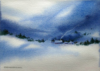

Snowbound   5x7  


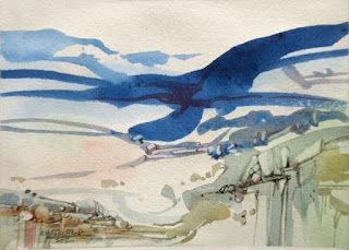
Rock Pattern Study  5x7

*Tip: 
If you'd like to try this, brush clear water onto part of the paper, pick colors you like, and brush them onto the wet and dry areas. Passages will be soft and diffused where the paper is wet, and sharp where the paper is dry.

Use different brush sizes, maybe even flick on a little color on and watch what happens. 

Let it dry a bit while you study what you have, and see if the shapes and colors suggest anything. If they don't, play a little more. 

When the paper is dry you can begin to emphasize shapes and colors in order to push the forms toward what you see in your mind's eye.

It's like walking on a tightrope, so don't be surprised if you fall off.....a lot.....but the more you do it, the better you will get.


Friday, April 6, 2012

Watercolor Play

Decided to drag out my watercolors and do some small paintings this week. They are almost like color sketches and are looser than my oils. Very liberating! When I go back to the oils I hope to carry over some of that looseness and intuitive way of working.

"Little House on the Rocks"  watercolor   4x6


"Mid Winter Snow"   watercolor   7x9

"Outbuildings"   watercolor   7x9

Monday, April 2, 2012

Visit to the Big City

Just picked up a couple of paintings at the Salmagundi Club in New York City. They were submitted to the Catharine Lorillard Wolfe Art Club Annual Members Show (now that's a mouthful) and hung at the club for several weeks.

Getting in and out of the city was easier than I thought it would be, not painful at all, and the visit to an environment much different from what I am used to was stimulating! But, it did make me appreciate where I do live at lot more!


Vanishing Woodlands - 20x24  oil on canvas

Blustery Day - 20x24  oil on canvas


Wednesday, March 28, 2012

Spring Means New Challenges

I've been entering a few competitions lately. Sometimes I get in, sometimes I don't. But each time I get a little more comfortable with the process. Though I have been working mainly in oils I decided to enter the National Society for Painters in Casein and Acrylic's annual juried show. Sent my CD with the digital image in yesterday. We'll see if anything comes of it.....

"What I Did On My Summer Vacation - Thumb Butte, AZ"   11x15  acrylic

Tip: When using acrylics, if you want to paint a large area of uniform color (like my sky, here) you will need to mix up a large amount before you begin to paint it. Acrylics dry so fast that if you mix as you go (like I usually do) you will wind up with spotty passages of color since it will be almost impossible to blend.

Sunday, March 18, 2012

Time to get out of my rut!

Occasionally, I find myself falling into ruts. So sometimes I must take action to break out!

#1. I adore landscape and the natural format for that is a horizontal one. I find it hard to remember the last time I did a vertical. I will step out of that comfort zone and do a landscape painting, but use a vertical format.

#2. Most of my skies are in the medium to light value range. I have it stuck in my head that a dark sky means twilight or night. I will use a dark intense value scheme, but still try to convey that it is in full sun.

#3. I have a very difficult time conveying a feeling of size or "bigness" when working in a small format. So I will try to convey a feeling of something enormous, even though I am working on a small canvas.

I'm very happy with the way it turned out and feel like I have new "arrows in my quiver" when it comes to landscape painting.  What do you think?


"Monumental"  12x16  oil on canvas