Pages

Showing posts with label Tips. Show all posts

Sunday, July 1, 2012

Color Theory Fun 2

My last "three colors and white" experiment turned out so well I decided to try it again (coulda' been a fluke, right?). But, this time I decided to try a different blue, one that I used a few times long ago and then abandoned because the results were so horrific. Prussian Blue.

So I dug around in my old supplies and came up with the crumpled metal tube that was my Prussian Blue from so long ago. When I do experiments like this, it is one of the few times I am glad I am a pack rat.

Cad. Yellow.........Cad. Red.........Prussian Blue........White

Clouds in Prussian Blue    8"x8"

Prussian Blue has won me over! Why did I hate it before? It's strong and can get out of hand if you are not careful, but what dynamite skies and green fields it makes. By using only three primary colors and white it becomes a much easier to achieve color harmony. 
Sometimes less is more!

Saturday, April 21, 2012

Less is More...sometimes

How much information do you need to provide before the painting "reads" as the scene or object you were trying to convey?

I've been enjoying experimenting with my watercolors and making small, very loose pictures. In trying to keep everything loose and spontaneous I sometimes work from the opposite direction of my normal method. Instead of having a subject then painting it, I just make some marks and let the paint flow. Then I look and see what it suggests to me. A few details added and I'm done. It is great fun working that way, but can include a high percentage of failures....Oh, my aching ego!

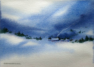
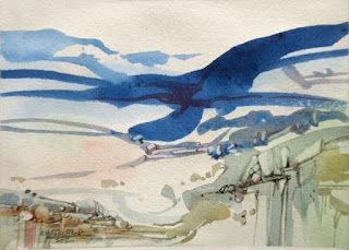
Here's a couple of little abstracted landscapes with maximum fun and minimum detail. The subjects suggested themselves after I randomly applied the strokes to the paper. Then I deliberately painted shapes to bring out my subject matter. Color has a strong pull for me and all day the cool blues I was using kept suggesting winter and snow.


Snowbound   5x7  


Rock Pattern Study  5x7

*Tip: 
If you'd like to try this, brush clear water onto part of the paper, pick colors you like, and brush them onto the wet and dry areas. Passages will be soft and diffused where the paper is wet, and sharp where the paper is dry.

Use different brush sizes, maybe even flick on a little color on and watch what happens. 

Let it dry a bit while you study what you have, and see if the shapes and colors suggest anything. If they don't, play a little more. 

When the paper is dry you can begin to emphasize shapes and colors in order to push the forms toward what you see in your mind's eye.

It's like walking on a tightrope, so don't be surprised if you fall off.....a lot.....but the more you do it, the better you will get.


Wednesday, March 28, 2012

Spring Means New Challenges

I've been entering a few competitions lately. Sometimes I get in, sometimes I don't. But each time I get a little more comfortable with the process. Though I have been working mainly in oils I decided to enter the National Society for Painters in Casein and Acrylic's annual juried show. Sent my CD with the digital image in yesterday. We'll see if anything comes of it.....

"What I Did On My Summer Vacation - Thumb Butte, AZ"   11x15  acrylic

Tip: When using acrylics, if you want to paint a large area of uniform color (like my sky, here) you will need to mix up a large amount before you begin to paint it. Acrylics dry so fast that if you mix as you go (like I usually do) you will wind up with spotty passages of color since it will be almost impossible to blend.

Friday, October 21, 2011

Reflections

When I was a little girl, it was my job to polish my mother's silver tea service for Thanksgiving and Christmas dinners. This is her sugar bowl and painting it brought back many memories.

Reflections on metal are fascinating. Silver is painted much darker than you would think and the best way I have found is to forget what you are looking at and simply paint the colors you see. Tip: Turn off the left side of your brain and give free rein to the right.

Works for me!


Sugar Bowl and Rose   6"x6"

Monday, July 25, 2011

An Image of the Mill

Heart of the Mill   14 x18

Here's my entry into the "Images of the Mill" competition. Though I think most will portray a distinctive tall red building that is on the mill grounds I was struck by the sun hitting an old millstone leaning against the side of the mill house. It created a formal composition of basic shapes that captured me. The rocks beneath the stucco seem visually complicated until you just think of them as spots of color. Forget what you are looking at and put down the spots. When you are done it will be a rock wall.

Detail: Heart of the Mill

Now to find a frame!


Thursday, July 21, 2011

Keep It Soft

The Clouds Roll In  8x10
Hay Days  8x10
 
Evening Falls  8x10
I have grown more interested in atmospheric effects as of late. Most of my works were concerned with the landscape and its varied appearances, but lately I have started to look up and see how interesting the sky can be.

I, also, have always painted in terms of sharp contrast and strong color. So with these three little studies I set out to keep the paintings soft and undefined for as long as possible. How much information can you convey without getting specific?

It turns out, quite a lot! These little paintings were done, almost exclusively, with a #10 flat brush. Only at the finish did I use a small round brush (#2) to make a few small lines and to sign my name.

*Tip: As long as you keep the edges soft, it is easy to make changes and suggest shapes. As soon as you put down a hard edge, you "pin it down". But, if a painting is all soft edges it can look mushy, and all hard edges can get boring. So beware of going too far in one direction or the other.

Friday, July 8, 2011

Plein Air in Carversville

I and three friends from the workshop that I recently took traveled to Carversville, PA and we spent a morning and part of the afternoon painting and enjoying the out of doors. We stopped to eat lunch at the General Store and had such a pleasant day we are going back again next week.


First order of business, Gather up all the gear. Pochade box, paints, brushes, medium, tripod, chair (if I need it. I usually paint standing), dry carriers, and camera. What you don't see is my big hat and sunblock (essential!).

We met in town, scoped out the area, and found lots of painting material.


Streams and woods.


A stone bridge crossing the stream.


A heavily backlit red barn.

Ok,ok,.....I know everybody and his brother has painted a red barn. But, the building adds structure to the chaos of nature and I like the backlighting. Never tried that before.


So I painted it!

In 1 1/2 hours I gathered enough info to paint a larger work if I wanted to, and though the shapes are somewhat awkward, it was the light I was concerned with and I am happy with what I learned.


No, she's not doing a painting of the back of her car.

When you can find a spot where you can use the back of your car as a taboret it is luxury plein air! Having a hatchback works great, too.    *Tip:You can actually paint in the rain with canvas and paints in the back, while you stand under the hatchback door.....unless you are super tall.


Painting the back of the Carversville Inn.


The light on a stone bridge was dramatic.


   In the afternoon the bugs descended and all the Off! in the world couldn't keep them away, but all in all, not a bad day!!

Thursday, June 30, 2011

Northeastern Waterfall


You may think I labored over this painting....but I didn't!

You may think there's a lot of detail....But there's not!

I completed the painting (it's only 10" x 10") in three short sessions of 1-2 hrs over two days.


Everything was scrubbed in very fast and loose. Then later, I became a little more circumspect and carefully added some highlights.

That's all, the paint did the work.


Here are steps:


Quick sketch to show major shapes and areas of value.


Major darks scrubbed in. This and the next two photos are actually much lighter than they look in real life.
The camera kept lightening everything up, seeking a middle value for the photo (it thought it was helping me). It wasn't until the final photo that I discovered that by focusing on half painting and half white sheet of paper, then moving to the whole painting without refocusing, I could trick the camera and get the photo to look more like the actual color values (guess I need to learn more about digital cameras).


Live and learn....


Strengthening the darks and greens. Still loosey goosey.


Now, I slow down and start to add some lights.  I am thinking about what hue, value, and intensity are needed to make some parts come forward and others to recede.
Though the water looks white, it isn't. I haven't touched it yet with highlights.

I usually (but not always) work from top to bottom. You can see that the top looks much more finished than the painting further down.

From this point on I was adding only highlights (remember the dark areas were actually much darker than show in this photo).


And the results!


Once I had put in the sunlit water the sky looked much too dark, so I mixed up a lighter blue and restated the sky.

Wednesday, June 15, 2011

Three S's for Plein Air

Frank LaLumia says that there are three S's to plein air painting: See it, Simplify it, State it.

See it: You must look beyond the beautiful elements and penetrate to the essence of the subject. Color and Value relationships between these elements are the foundation of your work. And you must translate a three dimensional world onto a two dimensional surface.

Simplify it: Keep the essential and eliminate the unnecessary. If you cram everything out there onto the canvas it will be chaotic and confusing. Decide what attracted you to the scene to begin with and emphasize that. Anything that doesn't support and enhance your idea can be eliminated. Here's where preliminary sketches are a help. Work out your ideas in a thumbnail sketch and you save a lot of time and paint.

State it: Millard Sheets said, "Don't search with your brush. State it!".  Decisions must be made all the time, but once decided, proceed with confidence. "State it" combines visual perception with technique. And because of the time factor in plein air painting, say it with as few strokes as possible.

I enjoy seeing the progression of the painting as an artist works, so here's something I just finished photographed at the halfway point and after finished.

Halfway through - this is painted on top of another, failed painting (I am ever frugal).


Finished painting - "Autumn Fields"   11 x 14


Monday, June 6, 2011

Quickie

I have such a pull toward refining whatever I work on that I am always in danger of making what I paint look like a photograph. And with apologies to Chuck Close, if I want it to look like a photograph I will just grab my camera and take a photograph.

So, a lot of my artistic life has been a conscious effort to loosen up and not be so enslaved by the exact image before me. But not being tied to the image before me does not mean I am excused from all the elements that create a good painting. I still must balance color, value, shape, texture, rhythm, repetition, space, etc, etc.

So here's my assignment to myself: Complete a small painting in 1 hour, working alla prima, and using twice as much paint as I usually do. I am so stingy with my paint (it's SO expensive) and this, by all accounts, can cramp your style and slow you down.


And here's the result.

It is rough and unrefined, but I am happy with it, nonetheless. It is only 8" x 10" and I used a #6 flat brush (about 1/2 inch wide) most of the time to keep me from getting detailed too fast.
Pushing the paint across the canvas surface created actual texture (as opposed to visual texture) and made for a rich surface.
I may use this study for a larger, more refined painting later on.
Or maybe not.... maybe I'll let it stand on its own.


*Tip - squeeze out twice as much paint onto your palette as you think you will need. That way you won't skimp on pigment and you also won't waste time having to stop to squeeze out additional paint and disrupt your painting rhythm.

Thursday, June 2, 2011

Wonderful Day....Epic Fail!

 Visited Trexler Nature Preserve in Schnecksville, PA, the other day and had a glorious time tramping along their well maintained trails and taking photos for future reference. I will definately be going back!

There are miles and miles of hiking and horseback riding trails that offer unlimited scenery and are rated "easy", "moderate", and "hard" (this is so that I, a novice hiker, won't wander onto the wrong path and wind up missing for days as I try to crawl back to civilization along a trail nicknamed "Death March").

The weather was spectacular and I thoroughly enjoy my hours in the woods. I even stopped to do a quick little painting, but the results were less than stellar (hence the phrase "epic fail" in the title).

Trexler Nature Preserve in PA.

I parked myself on the edge of a field, dragged out all my gear and went to work.


Here's what I saw.

My set up. The pochade box is the one I made (instuctions here).

A quick blocking out of the shapes.

First lay in of color.

After one hour.

I set a deadline of one hour for myself because I have a tendency to pick at things and get too tight too soon. Choosing such a short time frame forces me to loosen up and cover more ground, faster.

But, after and hour I was very unhappy with what I had. In the distance I could see a couple of hikers coming up the trail, so rather than answer questions and try to justify a poor painting (not sure why I should care what they think, though), I just packed up and started back.

What went wrong? I think I had two main problems. I should have seen it then, but when you work outside you have to think on the fly and that is something that gets easier with practice.
Not enough value contrast : next time I will bring a medium that speeds drying. That way the colors will not sink into each other and I will be able to more easily show contrast.
Not enough color variation : green, green, and more green!! Yes, there really was a lot of green out there, but I should have used a little artistic license to change those colors and add interest and depth.

So that's my analysis. What do you think?


Sunday, May 22, 2011

Painting Negative Space

Some painters (especially beginners) design their artworks thinking only of the objects they are portraying, but there is another element that must be considered. And that is the painting's negative space. Those spaces between the objects being painted are every bit as important as the objects themselves. Because these negative areas have boundaries, they also function as shapes in the total pictorial structure.
A good painting must function as a whole, with every shape, positive and negative, contributing to the total picture. 

I love "painting negatively" and here's a little study that is 90% negative shapes:

With a big wet brush, I scrubbed in a mixture of ultramarine blue, cad red, yellow ochre, and sap green. There are basically three different values, depending on the amount of thinner I mixed with the pigment.


A few more swipes with the brush to give a texture like evergreens and I start to paint negatively. White is the only other color I add to those I have used and with the same big brush (the canvas is only 9" x 12" so a #6 Flat is large in comparison) I begin to pick out some lighter areas in between the tree trunks. This also establishes the edge of the hill in the background.


Adding more white (but still far from pure white) I continue to break up the areas of color and refine shapes by painting around those shapes. The snow on the ground emerges at this stage.


Deep Forest Snow    9" x 12"
Final details are added with the lightest colors. No pure white was used, though, and the lightest areas have a little cad yellow added to warm it up. The only positive shapes added after the initial lay in of dark color are a few branches and twigs added to suggest a tangled forest. All other shapes I painted are negative shapes.


This is a great exercise to open up your eyes so that you see more when you look at a scene. Don't just look at the tree. Look at the spaces around the tree, the shapes between the twigs, the light shining between the leaves. Try it, it works!


Friday, April 22, 2011

Thumb Butte, AZ

Summer before last I visited Prescott, Arizona, and happily spent several days snapping away with my camera. The landscape there is completely different from what I am used to and I stored up memories and photos to be called upon later.

I hope to go back and paint on the spot in addition to photographing everything within sight (the artist should be able to find beauty in everything....I'm trying to live up to that).

Thumb Butte rises up out of the Arizona landscape and can be see from quite a long way off. You can hike up to the base of the vertical rock and if you are a climber (I am not) you can do a little rock climbing (my sons did some trad climbing up that big crack).

It is such a distinct shape and I decided to try a quick study from memory and the photos I took while there.


Prescott, AZ sits a little south of Sedona where the rock is red and so many westerns have been filmed. It was easy to imagine John Wayne riding up from across the valley. Wyatt Earp and his brothers hung out in Prescott for a while.

The rock of Thumb Butte is not red, but I'm the artist and if I want it to be red, it will be!
An underwash of red will give it a red glow. I sketched the shapes in with straight Cadmium red light.


Blocking out the shadows in cool colors will help to give the rocks dimension. I washed in the sky last to "cut" out the shapes along the top edge.


The blue in the shadows doesn't look as intense to my eyes as it does in this photo. One example of how the camera can distort reality.


Adding more color. I like to move back and forth between sunlight and shadow.

Again, the blues in this photo are really intense! Not so much when I look at the actual painting.

I will need to adjust some of those values, though.

By now the painting is so wet that any paint I add just sinks into the color below. So I am going to walk away for several hours and let it dry a bit. I will finish later.

*Tip: Your eyes may need a rest, too.  Come back later and you will more easily see what needs to be done.

The finished painting will be in my next post.... ("Happy Easter All")

Time to do some housekeeping (yuk!).

Monday, April 11, 2011

Color Palette Possibilities

People always seem to be interested in what my palette looks like, what colors I use and how I arrange them, so here it is:
For oils -

When I first started painting at age 13 my teacher showed me this way to set up my palette and I have done it this way ever since. I always know where the colors are and this saves me from searching as I work.

Upper left corner - Titanium white

Across the top, light to dark warms - Cad. yellow lt., yellow ochre, Winsor red (or Cad. red lt.), permanent rose, burnt sienna, burnt umber

Down the left side, light to dark cools - sap green, veridian green, cobalt blue, ultramarine blue, and sometimes Thalo blue


I often try out other colors and over the years some colors I use have changed, but this is my basic palette at the moment. Oils dry out on the palette, so once dry they get scraped off and thrown away.

For watercolors -

I never tackled watercolors seriously until I was in my 20s and my palette is set up differently, like a color wheel.  Think ROYGBIV! Red, orange, yellow, green, blue, indigo, (no violet, I mix that). Then earth tones down the right side. I use the same colors as in oils plus alizarine crimson, new gamboge, aureolin, manganese blue, thalo blue, raw umber, sometimes cerulean blue.

Because I work much faster in watercolor I have colors on my watercolor palette that I would mix myself if I were using oils. Saves me time that way.


I used to imitate the palette of whatever artist I was admiring at the time, but just because I was using the same colors didn't mean that my work looked like theirs. So, don't fall into that trap.

However, it did mean I got to try out a lot of different colors and find the ones that worked for me!

Tip: I never throw out watercolors, because even if they have dried out I can remoisten them by misting them and then putting a damp sponge inside the closed palette (all my watercolor palettes have lids). I just squeeze a little fresh paint on top of the old and I am ready to go!


Still making kits.....yuk!

Wednesday, April 6, 2011

Get moving with a Sky Painting

If I am not feeling particularly creative, or full of energy, one thing I can do to get myself fired up is tackle an imaginary sky painting. They go fast ( especially if you are working small) and, by nature of the subject matter, are easier than more detailed subjects. Once I start I feel the excitement start to flow, and before long I am totally absorbed.

Clouds and Fields - 8x10 oil

All you need to remember in order to make your imaginary subject matter authentic is a few rules of atmospheric perspective.

Tips:
Clouds farther away (at the horizon) are cooler.
Clouds closer (overhead) are warmer.
Clouds farther away show their sides and are more elongated.
Clouds closer show their bottom surface and are broader, rounder.
The sky is warmer than you think (don't use only blue)!


Evening Clouds - 5x7 oil


These three cloud studies were started loosely ( I had nothing I was working from) then grew from my imagination. Paint scrubbed onto the canvas suggested shapes and forms which I then refined.


Clouds Above the Hills - 11 x 14 oil

Wednesday, March 30, 2011

Start Painting!

Alright! I'm visually pumped up by perusing my books. I've sharpened my hand/eye coordination by sketching. So it's time to get started.


OK.

There it is. The blank canvas (it's so clean, so white).

Let's get started............(almost pristine).

Go ahead. Just do it!


SO, MAKE A MARK ALREADY!!!!!


Dang! Still stuck.
So, the final thing I do to overcome " white page syndrome" is tone the canvas. After that it is no longer so intimidating!

A wash of venetian red.


Now I can move forward.

I quickly sketch in the major elements with more venetian red.

Check out "Inertia 2" (earlier post) to see the sketch I am working from.


1st pass:

With thin washes of color I block in shapes, just to establish composition and get an idea of the balance of values and color. It's easy to alter anything you want at this point.
Everything is in flux and subject to change.

I keep stepping back so that I can see the whole thing at a glance. It is a small canvas (11 x14), so I don't have to step back very far. This is so I don't get caught up in one small area and forget about the rest.


2nd pass:

Another thin wash adding more color, emphasizing  some darks, intensifying some of the colors.

Still very much in flux, but getting more solid.


I'm working in oil, which takes a long time to dry. To counter this I can use any number of additives that are on the market to speed drying. But at this point the painting is so wet that any more paint I add just sinks into the paint below it, dulling the color. So I'm going to stop here and let it dry a bit overnight. By tomorrow it will be tacky and I can add paint that will retain its color saturation. Till tomorrow.......

*Tip: To make things go faster you can lay an acrylic wash on, to tone the blank canvas. It will dry much faster than an oil wash, and it is OK to paint oil on top of the acrylic. It is NOT alright to paint acrylic on top of oil. This is called the "Fat over Lean" law.